
The content operating system
Building the smoothest system and the best structures to give you the ultimate in sustainable content efficiency
Doing content well takes talented people, hard work, and really good systems.
Often, those talented people have to work harder because the systems they use aren’t good enough, or were designed for other types of work.
Friction in content operations is a huge drag on efficiency. It degrades job satisfaction, content quality and the end user experience.
Rapid content system diagnostic
This diagnostic sprint will give you a quick health check and tailored recommendations for improvements.
We know from experience that content systems, tools and processes are often filled with friction and inefficiencies.
This is an opportunity to smooth and streamline, improving the quality of your worklife and the efficiency of your systems. We’ll identify the strengths and weaknesses of your current content setup and identify ways to improve.
We have a few slots available for this diagnostic sprint, which will give you a super-quick content system health check and tailored recommendations for improvements.
Get in touch to book, or if you have any questions!

The problem
Too often organisations rely on a systemic tangle of documents, email threads, a mix of project management solutions (none of them designed for content workflows), calendars and documentation.
AI heightens expectations about the quantity of content that can be produced but is seldom used to its full potential to help make existing processes better.
So-called “content management systems” are mostly designed by web developers for web developers. Despite the name, the thing they singularly fail to do is manage content workflows.
Content for different channels is often created and maintained in different ways, by different people. It seldom joins up as well as it could.
As a result the content process is fragmentary and inefficient and the content experience for users is disjointed.
It doesn’t have to be this way.
The solution
A bespoke, state-of-the-art content operating system will save you time and money and allow you to do better, more joined-up, more rewarding work.
We’ll assess and transform your system, giving you a bespoke, unified solution to planning, tracking, managing and working on all your content. We’ll also layer AI on top, giving your system tailored superpowers to work better and faster.

We’ll build in your content and organisational structures (templates, content model, information architecture), brand, governance and strategies so that this system is not just a brilliant system, it’s a brilliant system designed just for you.
The technology we use is best-in-class but also easy-to-use, easy-to-adapt and inexpensive. You won’t incur technical debt or be tied in to an expensive solution with only one vendor.
Our packages are progressive and modular, allowing you to pick the perfect solution for your situation, or to start small and grow. Whichever options you choose, we’ll give you everything you need, including documentation, training and support, and we’ll be on hand to help the system grow and adapt as you do.
1.
Assess
Content operations diagnostic
For organisations wanting to understand their current state and opportunities.
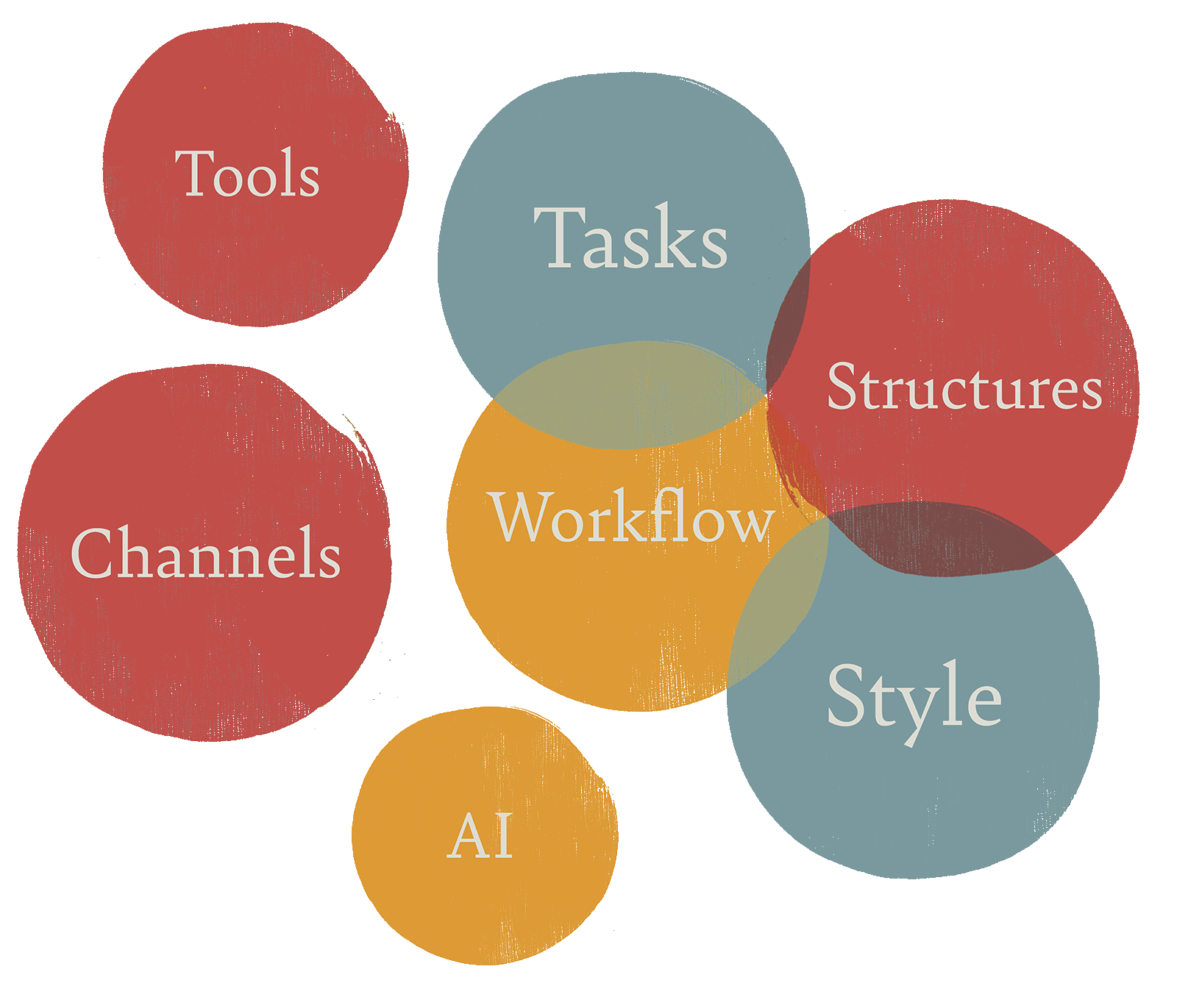
We’ll audit and assess your current content operations – your workflows, tools and systems, governance, maintenance, structures and resources – and report on your current reality.
We’ll also create a set of prioritised recommendations for improving efficiency. We’ll present our assessment and recommendations to whoever needs to see them.
2.
Transform
Building content operations foundations
For organisations ready to implement great content operations.
We’ll create key underlying system components: goals and KPIs, custom workflows and standards and a governance framework.
Using these, along with your content model and the knowledge from the Assess stage about your resourcing and structures, we’ll diagnose the best technology options for you. Then we’ll build you a bespoke content operating system, for the very best in usability, personalisation and flexibility.
This system will combine content planning, task management, a bird’s eye view of the state of play and personalised dashboards for everyone involved in the content process. It could also include a headless CMS and structured content model.
A content calendar will integrate seamlessly into calendaring systems. Versioning, suggested and tracked changes will make life easy for editors. Notifications will remind people of tasks and progress.
3.
Excel
Advanced implementation
Adding AI takes your content operating system to the next level. It allows for checks against your voice, tone and style guidance, and in-line suggestions for improvements that are tailored directly to your brand.
It gives you a permanently on content assistant who can provide ideas, structural suggestions and checks.
We’ll set up a bespoke AI integration for you, making sure that you’re getting the very best, tailored use of the latest technology.
Advanced strategy and implementation support and guidance will ensure you get the most out of your system. We’ll help with change management across the organisation and we’ll run quarterly process optimisation and strategy workshops to further enhance your setup. We’ll provide updates to templates and AI prompts too.
4.
Enterprise
Transformation at scale
However large you are, and however complex your content needs, we can scale this system up to fit.
We work with complex organisations with teams in multiple locations.
Translation and internationalisation add layers of complexity to content. In those cases, content operations systems that scale are even more vital.
We’ll include a messaging framework and string management with localisation, enabling your content and your content teams to thrive all over the world.
All this comes with all the benefits of our Excel package, meaning you get the bird’s eye view, the personalised detail tracking and all the advantages that integrated AI brings as well.
Optional extras
Content is complex, and every organisation’s setup is different. Think of these as side dishes which could also be taken as a main… Depending on your context and what you already have in place, these could be just what you need.
Strategy and structure
- Content strategy development
- Content modelling
- Information architecture
Governance
- Governance framework
- Content style guide
Technical
- CMS integration
- Custom workflow design
Ongoing support
- Additional training
- Monthly strategy sessions