Atomic content
Why content chunks are better than pages

Atomic design changed the way people thought about web design. Brad Frost and others made people see that designing smaller, reusable components made more sense than starting with whole-page layouts.
Pagethink
Atomic design is widely accepted as good practice. But when it comes to content, mostly the page still rules.
The page is a ubiquitous, deeply ingrained, way of working and thinking. It’s been around for thousands of years: even when words were written on papyrus or slate the concept was very like a page. Here’s a blank space; start at the top, fill it with words and keep going until the bottom. The page has been the default chunk for a long time and it’s deeply ingrained in our way of thinking about content.

Even in a digital-first world, people tend to think and create page-first. Word processing has done little to change that. Open Word or Google Docs and you’ll still be met with something that looks like a blank page of A4 paper. But using the page as the starting point for digital content is inefficient.
Pages are hard to repurpose. Editors can deconstruct finished pages and pull out elements, but this takes time. And often the extracted elements work less well than they would if they were designed as adaptable components from the start.
Considering the chunks
Modular content is not a new idea. Dickens’ Pickwick Papers, serialised in periodicals in the 1830s, changed the way people thought about the structure of the novel; each chapter stood up on its own but also worked as part of a greater whole. TV series work in a similar way, and even movies are often parts of longer-term franchises.
Websites allow modularisation on a different level. Long-form content and page builders like Divi and Elementor have changed the way people create rich, multi-format digital content. The Gutenberg project is changing the paradigm that WordPress uses to create content. Paragraphs in Drupal do something similar.
Breaking out of the paradigm
Good digital content has broken out of the body text and hero image convention. Drag and drop interfaces put huge potential power in the toolboxes of content creators.
Statistics, quotes, graphs, video, audio, maps and images can all be combined to tell engaging stories, to educate and to convince. But too often these components are primarily design elements; part of the presentation layer.
These new page-builder systems are great at imposing atomic design patterns across a website. But they are not always brilliant at modularising the content itself.
Designing for adaptability
A case study may just be a photo and a short paragraph, but it may be used in an opinion piece, in a report and on a landing page. It might also make a good basis for a social media post.
An author might also be a speaker at an event; the price of a product might be needed in an article and a product page.
Considering these chunks of content as structured components, or elements, allows for tagging, for single-point updating, and for more intelligent re-use. Correcting a mistake or adding a link in one place corrects it everywhere.
When we’re building websites and content systems, thinking at the outset about the smallest possible repurposable components means that we maximise the flexibility and sustainability of our content. Which improves life for content consumers and creators.
Headless content management systems – such as Storyblok or Sanity – are better than others at allowing content to be structured effectively.
An atomic approach to words and pictures (and numbers and audio and all the rest…) allows for intelligent, adaptable, structured content. If we design and build atomic content systems we can avoid chaotic content complexity and enable people to create brilliant, sustainable and adaptable content.
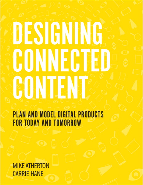
Designing Connected Content
Carrie Hane and Michael Atherton’s excellent book explains how to design, plan, and structure content that can be used now and is ready for the future.
